Disinformation Research Platform
New Knowledge
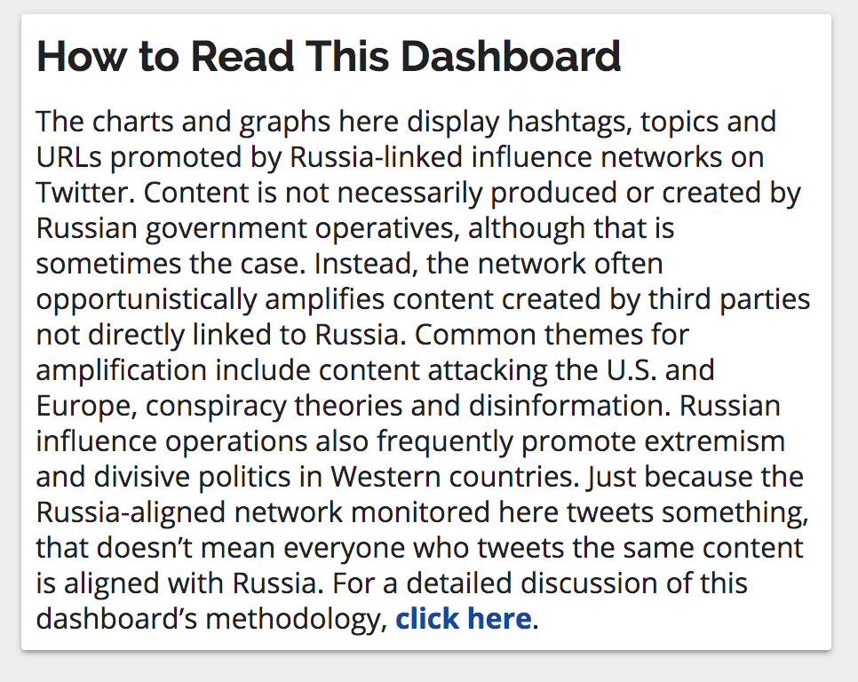
Disinformation is false information spread deliberately to deceive.
Disinformation Research Platform is a platform and dashboard for journalists, disinformation researchers, and editorial readers to discover the relationships between the elements of conversations on Twitter. Understanding the conversation is the first step to discovering the source of disinformation.
The Challenge
The existing dashboard, while functional presented challenges for users trying to explore the data and understand the relationships between data and conversations. A redesign was initiated to discover the source of usability problems, and find solutions for improving the user experience as well as look and feel.
The Process
The design process begans with discovering the users and the challenges they face through interviews. Once the user objectives were defined, wireframes were sketched. Once the wireframes were approved by stakeholders, a prototype was coded from the existing application.
Research & Interview
Sketch wireframes
Code Prototype
Test
Discover user roles
From discussing with key stakeholders, three key user roles were discovered.
Disinformation researchers - sociologists, data scientists, analysts, and other people interested in disinformation research.
Journalists - writers covering disinformation news.
Editorial Readers - informed readers interested in learning more about disinformation research or to verify what they are reading.
Define User Objectives
From interviewing stakeholders and real users, the objectives of the platfornm were discovered.
- Understand the source of the data, the format, and filter options of the data.
- View the most active metrics across the platform
- Understand the relationships of metrics to other metrics
- View changes in activity of a metric over time.
- View data by metric category
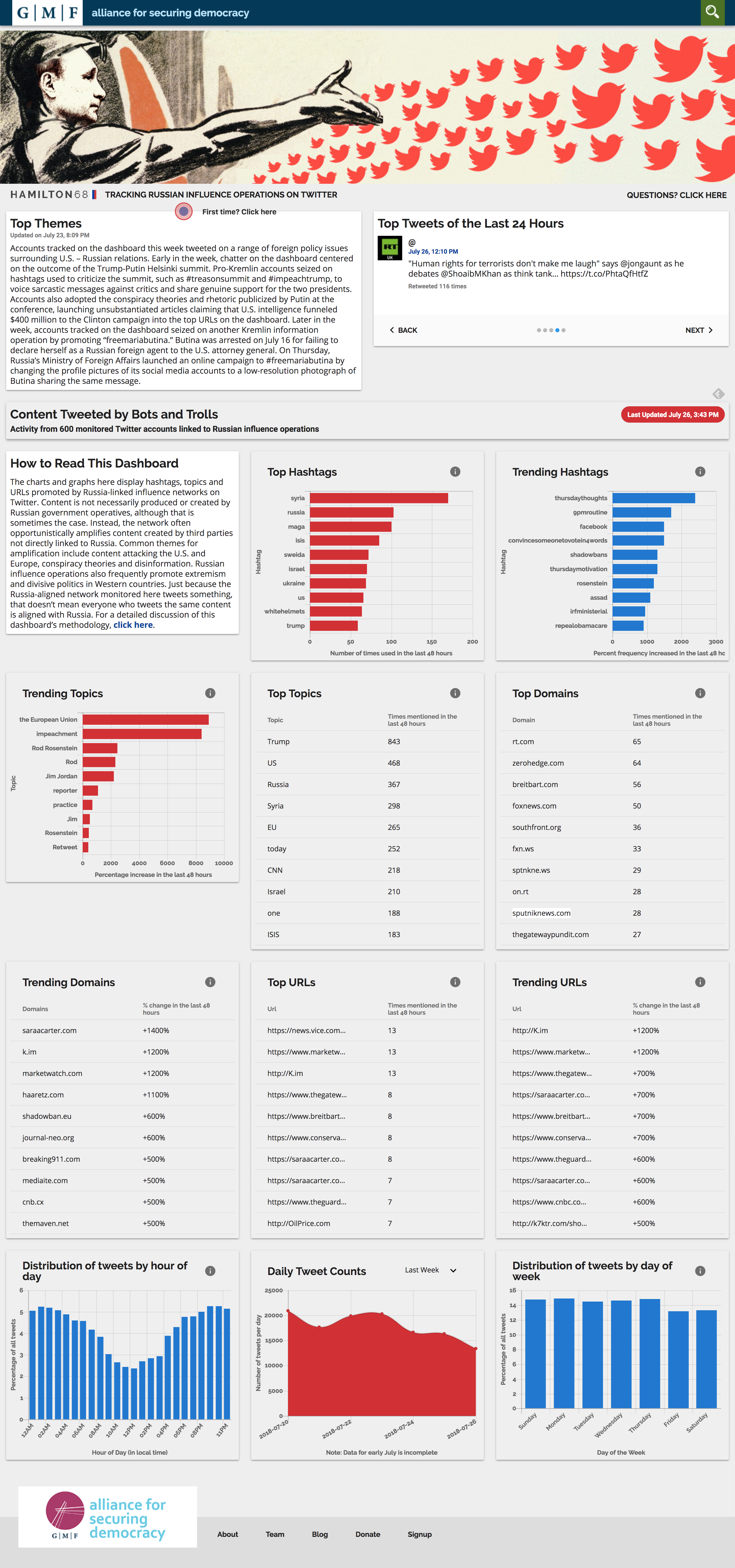
The original design before redesign.
Goals for improvement
From reviewing the existing design, interviewing users, and discussing with stakeholders, the team came up goals to solve the problems discovered.
Improve discovery of data and relationships
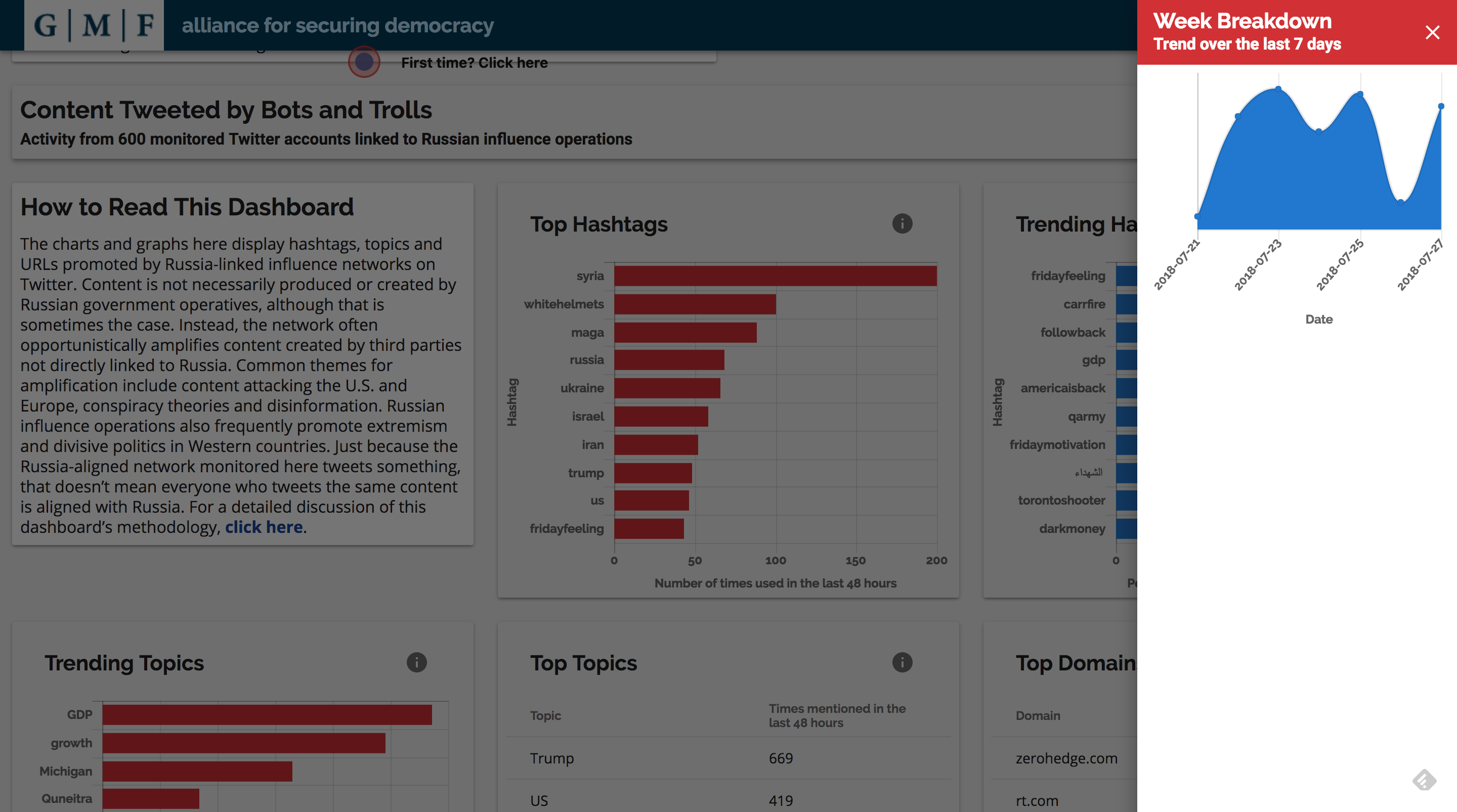
The existing design was cluttered and difficult to navigate with all of the visualizations on the same page.
Links to more the detailed breakdown of data points were placed in an unintuitive on the visualuations.
Different metrics and data points showed no relationship to one another beyond rank. This made it challenging to discover meaningful connections between data points.
This view opened up when clicking on a visualization.
Show, don’t tell – let the data tell the story
The explanations of the page were long and difficult to understand.
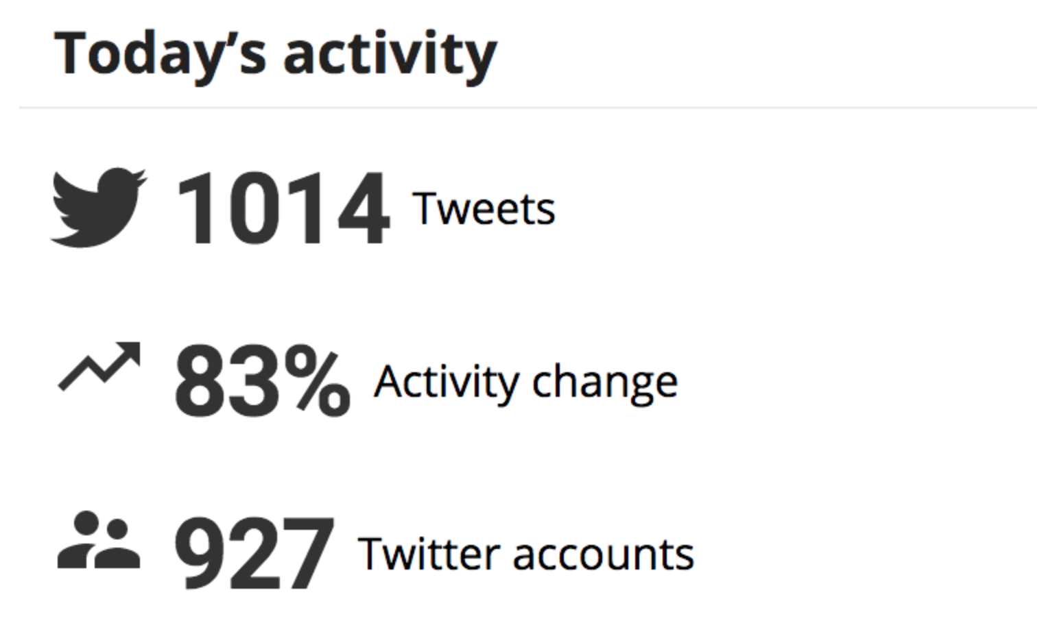
Key metrics were scattered throughout the page rather than organized in a relevant way.
Improve visual design
Remove header image that does little to provide context.
Add contextual color.
Create more uniform layout.
This card took up a large chunk of space at the top of the page.
The Solution
With our goals in mind, we set out to interate on ideas for how to achieve what we set out.
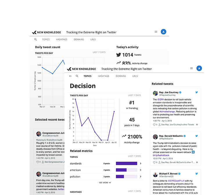
Create a structured page layout
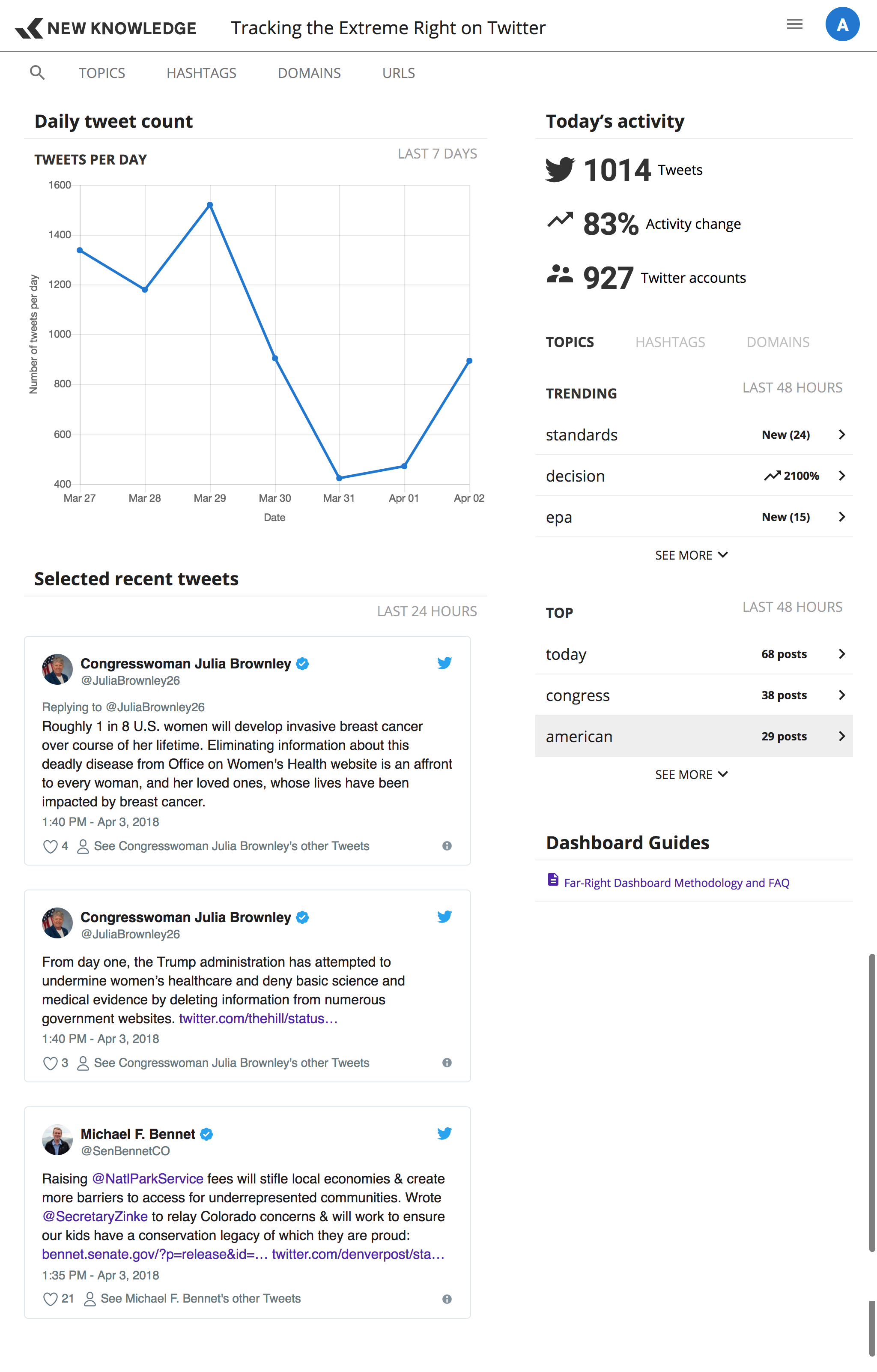
A newsfeed structure was created so that new visualizations can be added to the overview page.
Some wireframe sketched interations for the design are shown below.
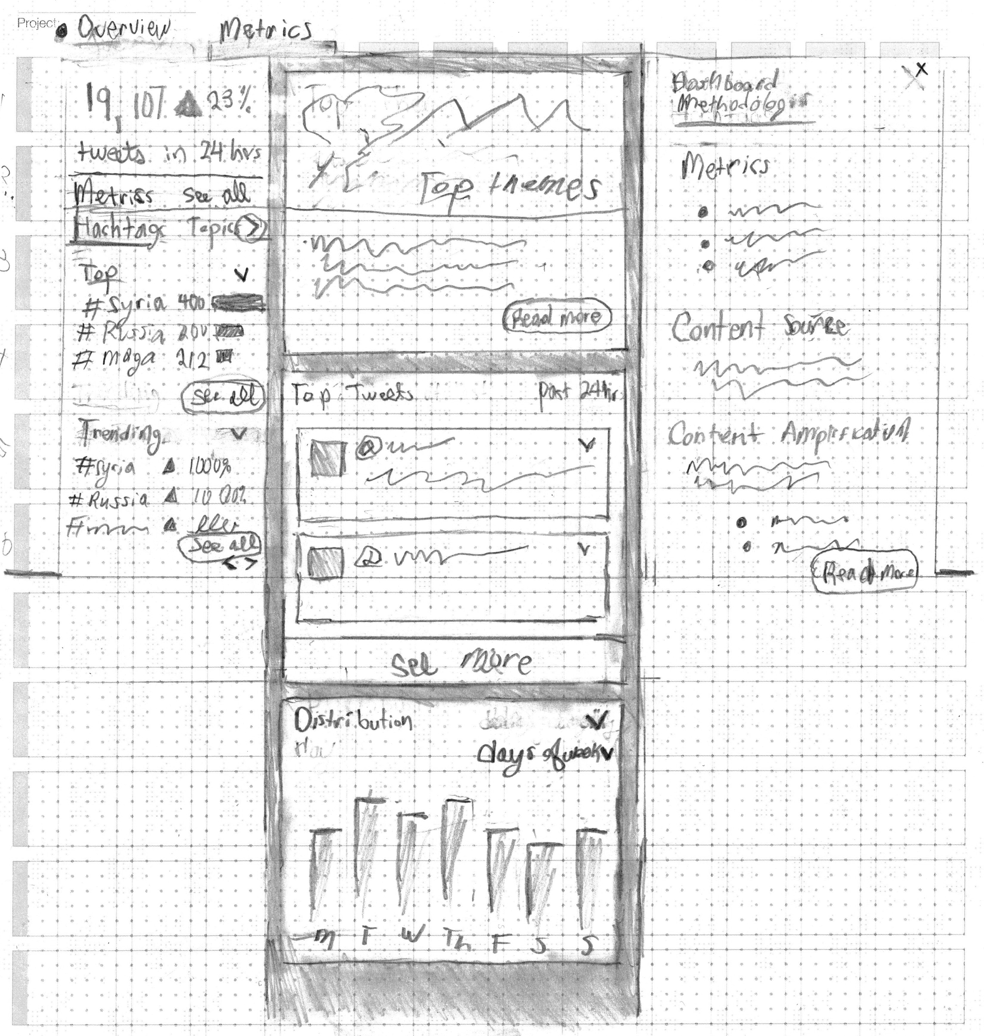
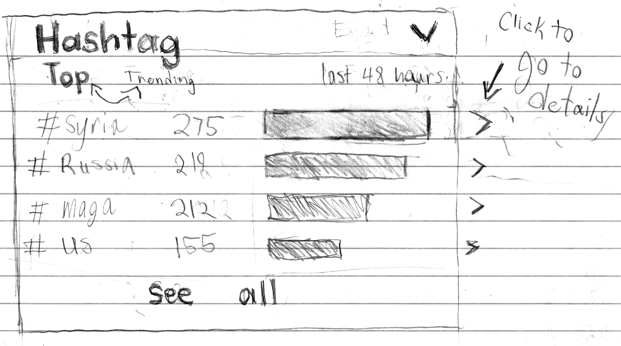
The first sketch of what the new cards with links would look like.
Make the visualizations part of the navigation
Add arrow icons and hover states to signify clickability
Create routes for data points, so revisiting metrics and sharing is possible.
Let the user seek granular data through navigation.
Change the flat information architechture to a structure of:
Overview
Metric lists
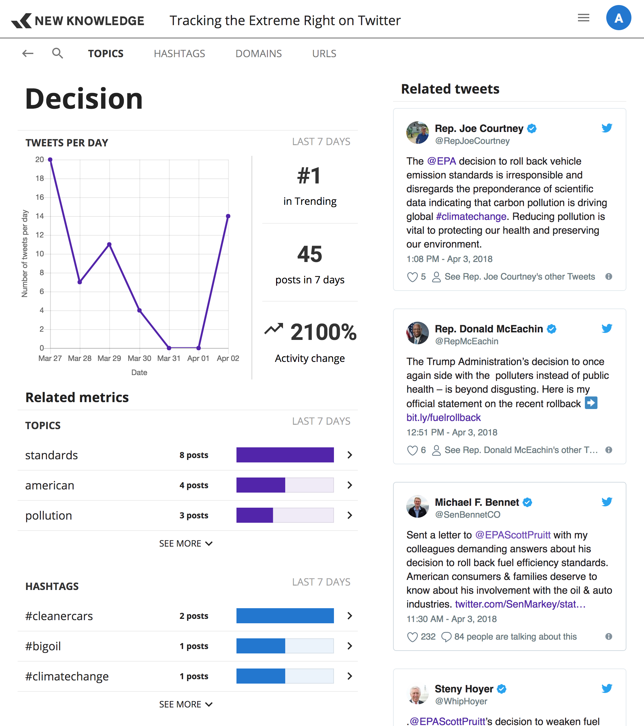
Metric Details
Tell a story with data
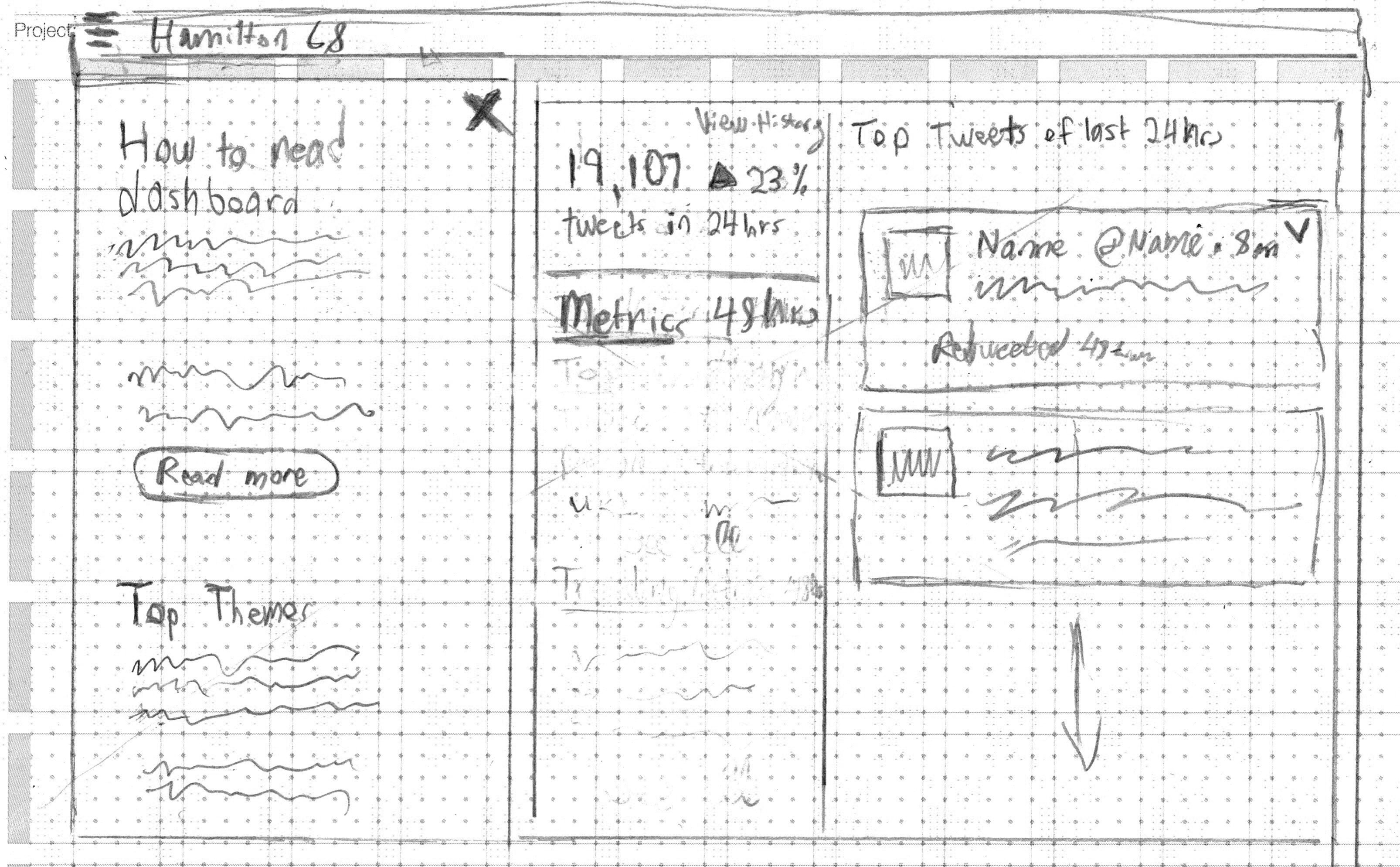
Instead of using a large paragraph to explain the data, let the page title, the metrics and the labels tell the story.
Dashboard guides were linked for those seeking additional information.
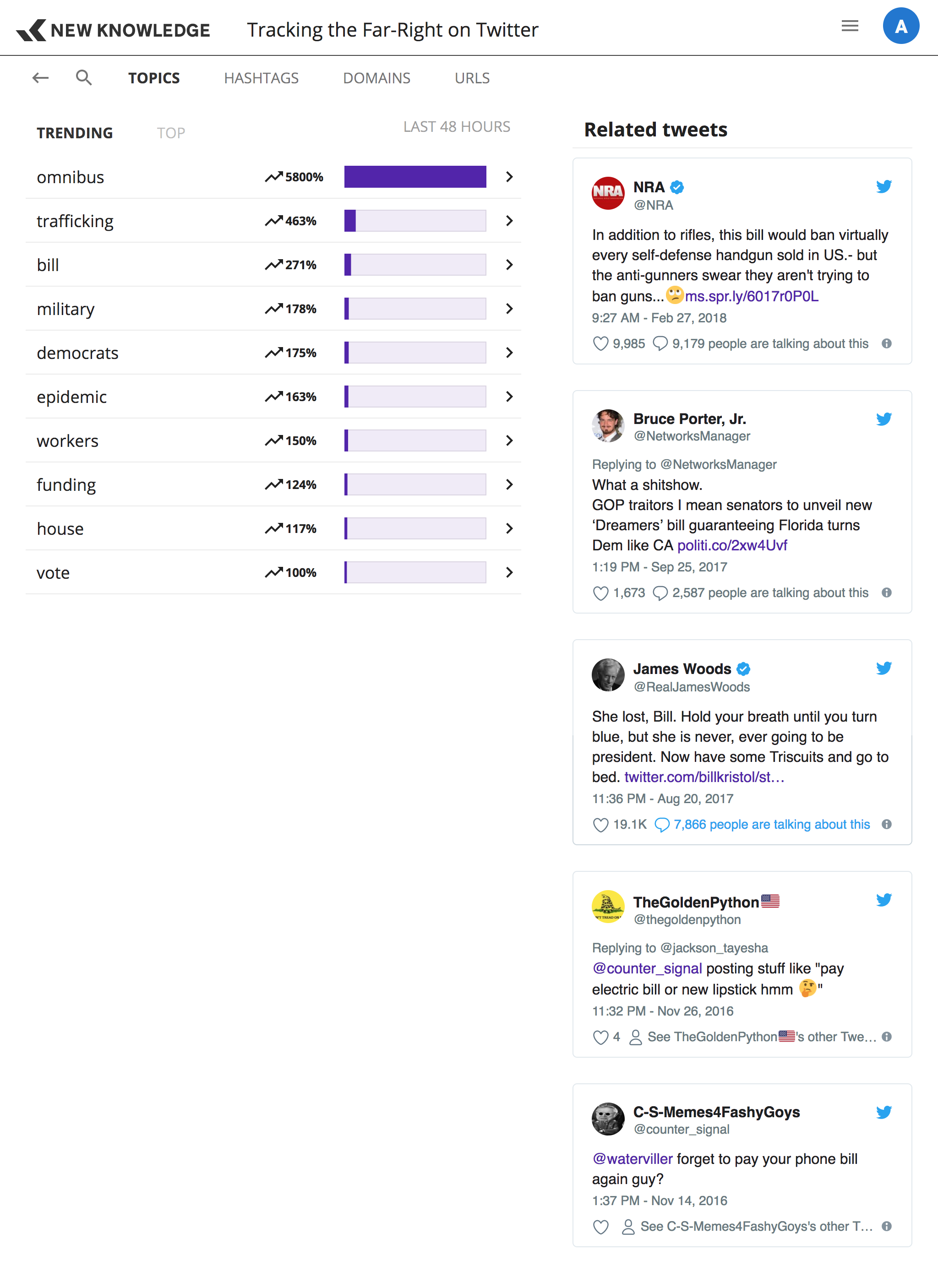
Provide evidence and examples
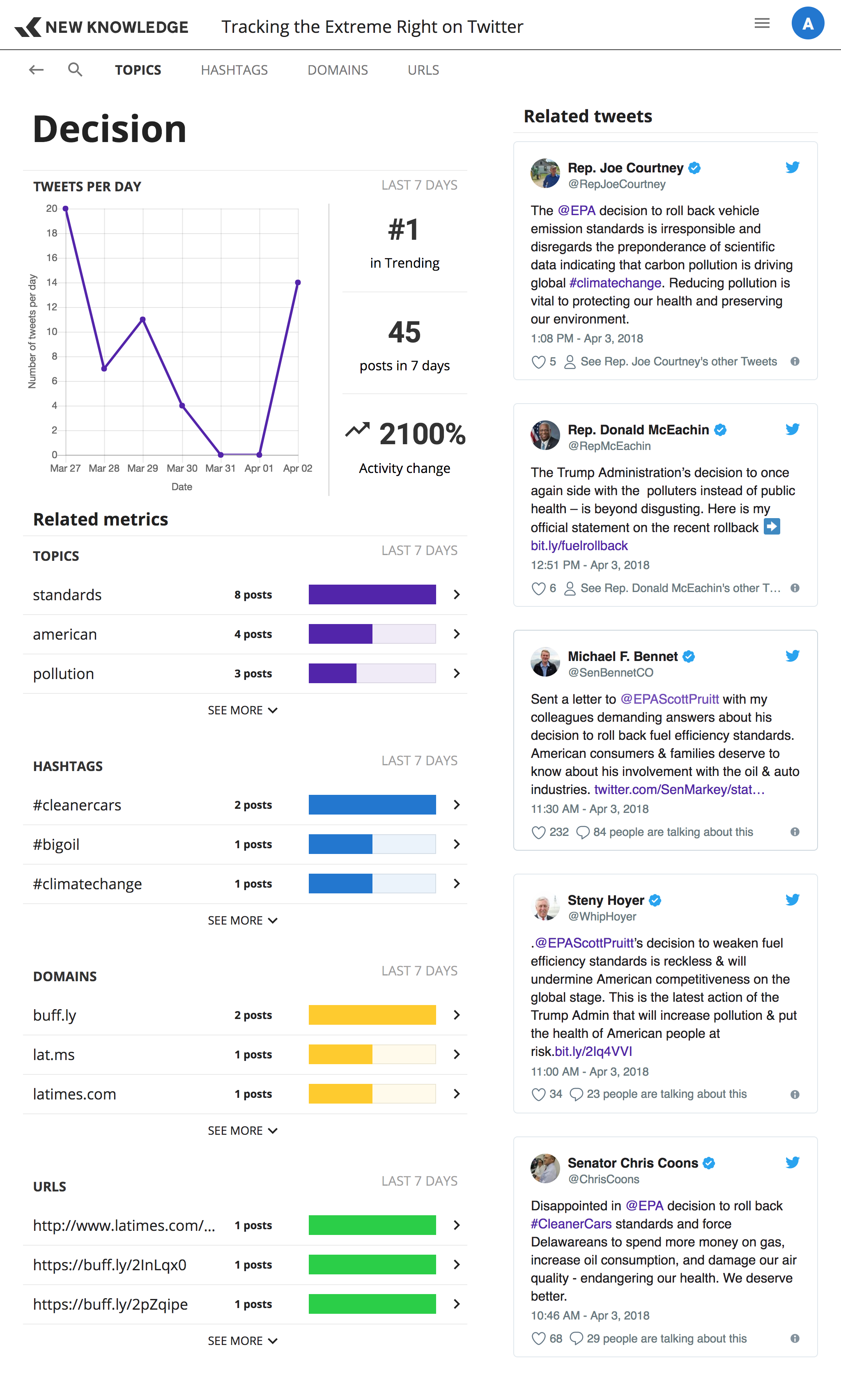
Drawing a connection between a hashtag and a topic might be difficult until you see it written in a tweet.
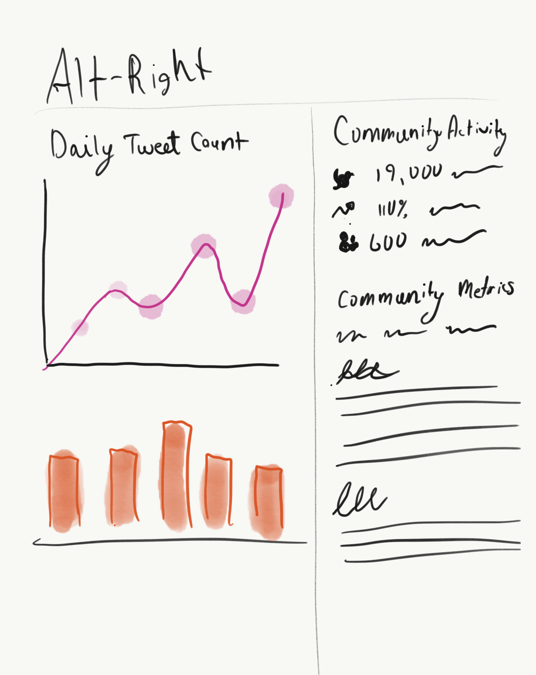
Show relationships between metrics
A section below a metrics detailed break down shows other metrics that are appearing in the same context and might be related.
Use color to differentiate metrics
Topics
Hashtags
Domains
Urls
The Deliverables
Overview Page
Metrics List Page
Metric Detail Page